VMWare developer Ben Gertzfield did a really awesome thing a few days ago, he commented on my blog. What’s so cool about this is that Ben is a VMWare Fusion developer — and I had a seemingly throw-away line in that post that “VMWare fusion is not as user friendly as Parallels” — and Ben asked about how they could improve VMWare Fusion.
That’s INCREDIBLY cool. The man is doing Google Blog searches or has an Alert set up, or whatever it might — and he’s actually going out and asking real questions about how to make the product better. That’s awesome. My colleague Ben MacNeill does the same thing and I’ve always been impressed by it (and thankful to be working with Ben because of it). Along the same lines — I received a comment from Marc Hedlund (or someone helping Marc do this), one of Wesabe’s founders about using Wesabe. I’m still a little squicked out by doing my combined finances in a web application — but marketing like Marc/Wesabe did with that comment goes a long way to influencing me to trying it out. It’s about reaching your customers where they are.
It’s an old saw, but marketing like this turns customers or potential customers into fans. Like Kevin says you have to be the ball.
Ben, VMWare Fusion was already a great product, I’ve had zero problems with it running it the last few days, using both Windows XP and Ubuntu. I’m a longtime VMWare user on other platforms, and I’ve used Parallels since just after it came out — and I’ve been happy with it too. But that single comment, combined with the energy that you really show for the product in your blog (even if it was setup for that express purpose), helped cement my continued use of Fusion for a long time (okay, just don’t like the product turn to crap 🙂 ).
Ben asked for a few observations about the usability — and I spent a fair amount of time with both products yesterday and today trying to figure out some specifics about my throw-away line. I’m probably a terrible poster child for usability — I couldn’t design a good UI if I wanted to — and there are some things I am too nerdy about to judge other UI either.
This is also done using the Fusion 1.1 Release Candidate. I think that’s fair to evaluate, but it isn’t an official release, so those reading this should keep that in mind.
My take-away is that the settings interface is really at the core of my “user-friendly” comment.
The first general impression I have is completely subjective. But I like the way that Parallels handles the vm “object” (for lack of a better term) — I don’t like the Parallels “picker” — but once a VM is picked — I get a window with the state that the VM is in — and a list of settings and controls:
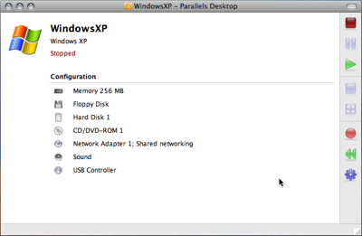
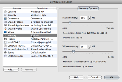
It’s not real clear from the Parallels window that I can click on the configuration and make changes, but if I do — I get what I consider to be a better interface for browsing those settings:
If I click on “Settings” for the VM in Fusion, it will bring the display window for the VM — and show the settings as a property sheet.
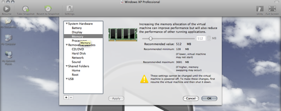
This is really subjective — but I think the Parallels way of doing it is more understandable — and better “information at a glance” — I shouldn’t have to have a display window (which is black if the OS in the VM is “off”) pop up to manipulate the settings for the VM — and the summary views are nicer I think.
To be fair, I hate property sheets. So that’s part of it I think. And whether this qualifies as “User Friendly” probably depends on the user.
Something that I don’t think is as subjective — shows up when changing the settings for something like the Shared Folders — this is where the Parallels dialog has an advantage (p.s. that drag and drop of files between fusion and the finder is FANTASTIC, really great implementation). I think shared folders in general needs some work — I actually had some trouble with the text of .hostShared Folders and trying to figure out what that really meant in terms of getting access to resources. Focusing on the UI though, this:
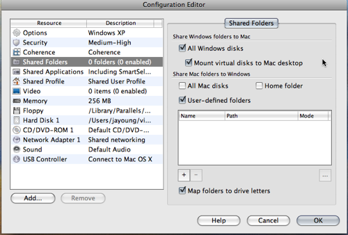
is preferable to this:
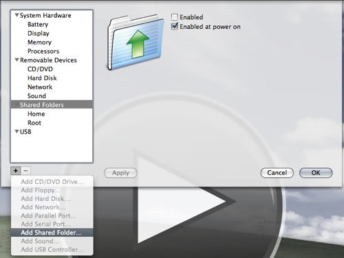
I actually had to go to the help to figure this out. I completely ignored the “+/-“ controls on the left because they didn’t make contextual sense to me. Having them there implies that I’m going to click them to add a new “setting category”- not a sub item for the categories — placing them on the right, and limiting the list to the context of whatever I’m focused on would seem better to me.
I also would like to see all my shared folders at a glance on the right rather than having to click each one on the left.
(actually I kind of like how Parallels does it by default — mapping a volume on the Macintosh side to the entire disk for the VM — although that seems broken in Leopard — perhaps due to some issue with the version of MacFuse that it uses, at least from the messages in my console log)
These were some of the things I focused on. I think there are little things like this elsewhere in the settings, and in the menu layouts. Having a general usability walk through of the settings sheet in particular by someone that that is a real usability wonk would do wonders I think. The settings work — I was able to go through and setup up what I wanted (actually for shared files — I’ll just drag and drop — man that was great that it worked so well) Virtualization is naturally a bit geeky to begin with, but cleaning this up could help a bit, and probably cut down on support requests. I know that a lot of faculty that I work with will be trying this out, and I know they are going to get lost in these properties if they try to set them (most will just take the defaults, which do work well).
Anyway, that’s my $.02 — I’m sure there are a lot better reviews out there to come on this subject. Most of all, I really, really appreciate the fact that Ben is asking.