This commentary (linked to by Jeremy Zawodny) is pretty fascinating — on all kinds of levels.
One — the tastyresearch blog is pretty cool in and of itself. Two, I absolutely dig the subject matter. The fact that there are broad linguistic differences in the United States is a pretty interesting subject. ( I’m fascinated by the vocabularies we invent in our fields to communicate amongst ourselves in medicine, computing, animal sciences, etc. ).
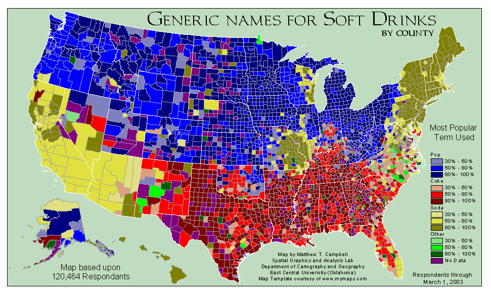
But really is interesting about this is found by digging deeper. As I started looking at the generated graph — two things stood out:
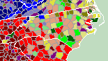
- the North Carolina data is pretty interesting.
- I’m intrigued by the blob of Soda around east-central Missouri and south-west Illinois.
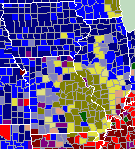
I started trying to rationalize why this might be. Missouri/Illinois I could understand from emigration to St. Louis.
But North Carolina’s data was just weird. Could that be because Pepsi started in NC? Throwing off our southern Coke heritage?
So I went looking for the data.
The site linked to by TastyResearch is the source. It’s an older (pre-2002) internet-only self-reporting survey.
In other words, not very accurate science. At all. It’s entertainment and general trends. It probably does reflect general viewpoints pretty well.
But when you really look look at the data — that’s when you begin wondering about things — can ~3300 responses from NC build an accurate county-based view? I’ve forgotten all my statistics, but I’d say for most of the counties, no, the margin of error is too great. However, it is language, and you might have to assume that good data in one county probably likely correlates well with the neighboring county (at least for words like these). But it’s still really entertainment.
At the end of the day though, I really love this kind of data view — especially working in Extension. And would love to figure out ways we can begin to do these kinds of things, and find more accurate data reporting.